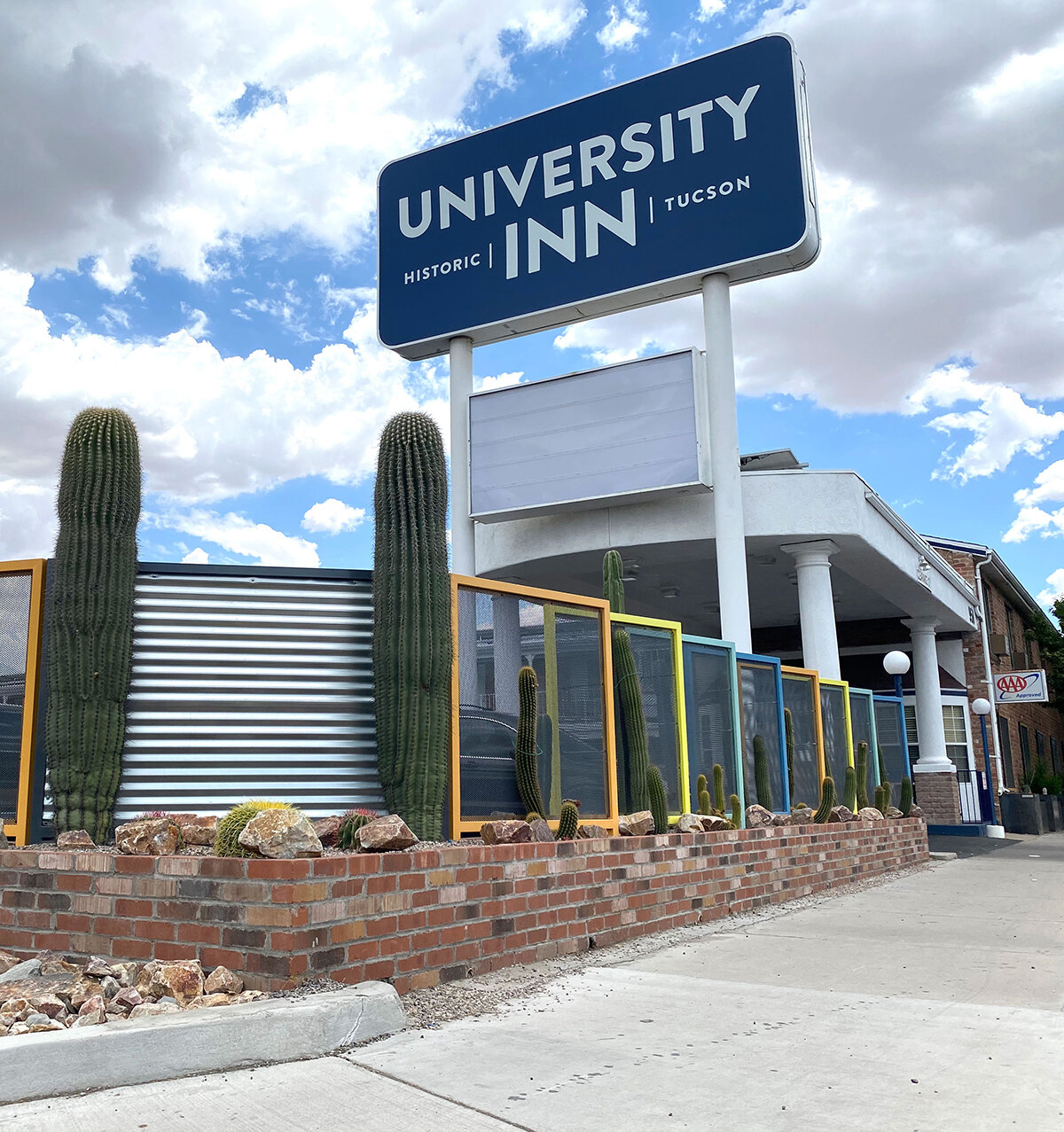


Ravi Patel, the owner of the historic University Inn in Tucson, Arizona, contacted me when he was looking to rebrand his newly renovated hotel. He tasked me with creating a wordmark that would express the Inn’s new, modern experience while maintaining elements of its historical heritage. It needed to be bold and quickly recognizable as people drove by the Inn.
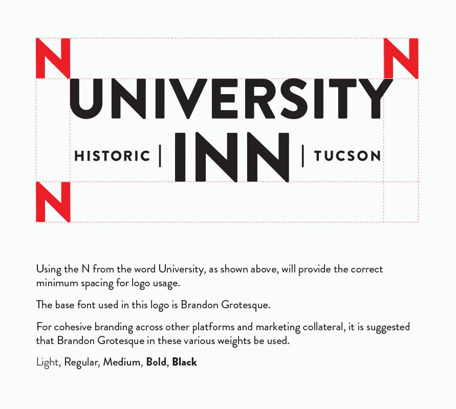
This wasn’t my typical logo job. I had to educate myself on best practices for sign creation, where visibility is key. Further, being a wordmark, all of the brand’s character had to come through the typography alone. It had to have good visual contrast between positive and negative space for long-distance legibility but still be balanced when viewed from below on a sign and from straight on as a logo on marketing material.
Once we locked down a balanced layout, we set about finding a typeface. Ravi’s primary objective on the creative brief was visibility from the street, and where better to start than with the typeface Interstate—a font used on many road signs all over the world. However, Interstate was very precise and clinical in its construction and lacked the warmth and personality we were looking for.
Then I remembered the typeface Brandon Grotesque and thought it might be a great solution. Highly legible, inviting, and modern with a nostalgic feel, this typeface conveyed the very character of Ravi’s business to a tee.
With the composition established, we ventured forth into color exploration. Because the logo needed to function well on a large sign outside of the Inn, Ravi and I chose an off-white text set upon a dark blue background. It not only complemented the new aesthetics of the building and its decor but was also highly visible against the sunny Arizona skies during the day and equally well-framed when illuminated at night.
The structure provided by Ravi coming into this project sounded like a daunting creative restraint, but it turned out to facilitate growth and further refinement of my creative process that ended up better serving the objectives of this project brief.
I’ve found that I love working on projects that push me to learn and grow—projects that build excitement and expectation as they unfold and solutions are discovered. After all, when we embrace change, we design for change.