


We've worked closely with Lendmark Financial for many years now, on all aspects of their marketing, from print to digital and everything in between. For our second overhaul of the site, they wanted to take a mobile-first approach. Our team suggested adding a site-wide living style guide and modular components that could be plugged into a content management system for ease of testing and growing their digital presence in-house.
The three core objectives going into this project were to enhance lead generation through SEO and organic listings, provide a highly personalized, segmented experience across multiple touchpoints, and offer a nurturing/retargeting approach to customer acquisition while building brand trust along the customer journey.
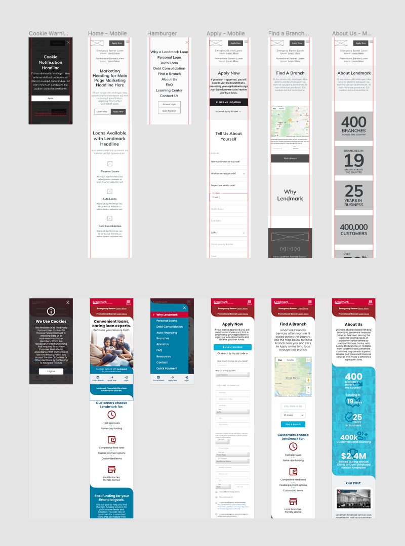
Before designing the style guide, we defined our user task flows, created wireframes and prototypes for many pages across the site, and set up additional landing pages. Our team lead brought a diverse range of ideas to the table with her user research and the customer personas she created. She also presented a detailed plan for A/B testing to the team, to help drive design strategy and construct an efficient user journey straight out the gate. Accessibility was also a key concern throughout the various stages of development to be sure we met industry standards and every visitor had an intuitive and enjoyable experience.
The client wanted to push a more personalized experience by promoting their “Brick & Click” conversion modal so the new site design would initiate the transaction and guide the client into one of their physical locations to complete their application. There was a big emphasis on clean, flat design geared toward a younger audience since 90% of current traffic was on a mobile device and under 50 years old.
In an effort to draw in an even wider audience, we added customer testimonials to the site that highlighted positive experiences with Lendmark. We reinforced these testimonials with appropriate imagery and photos from recently renovated branch locations.
To build quick confidence with new customers, we designed the About Us page around an infographic promoting the company’s philanthropy and community outreach, overlaying a collage of happy customer headshots. We also used a more approachable, mobile-optimized font and pushed the new branch color schemes into the site design for better brand continuity between virtual and physical spaces.
Finally, we wrapped up the design with a stripped-down footer for the mobile breakpoint that preserved access and functionality to all the disclosures and forms that were important to their business operations. With the UI design complete, we gathered the assets and compiled a living style guide and modular components for future use.
This project was a great opportunity to build relationships between departments on our team and create a much more collaborative work environment. Our team leader put the brakes on the initial urge to expedite the design phase and demonstrated the importance of user research to discover the actual problem we were trying to solve. With her expertise in UX design and research leading this project, we were able to establish our goals upfront, execute the necessary foundational steps before starting the design phase, and deliver a thoughtful, effective solution.